3D illustration
- Zack Scanlon
- Nov 30, 2020
- 2 min read
Updated: Dec 2, 2020
This project started with gathering some ideas about what i wanted to make, my base idea was to have a batarang of the left, a holocron from star wars in the centre and a urkai hai off on the right, so i made a sketch in photoshop to get a rough idea of the layout of the items and the composition of the image. In the end i decided to go for a more central idea of just lord of the rings.
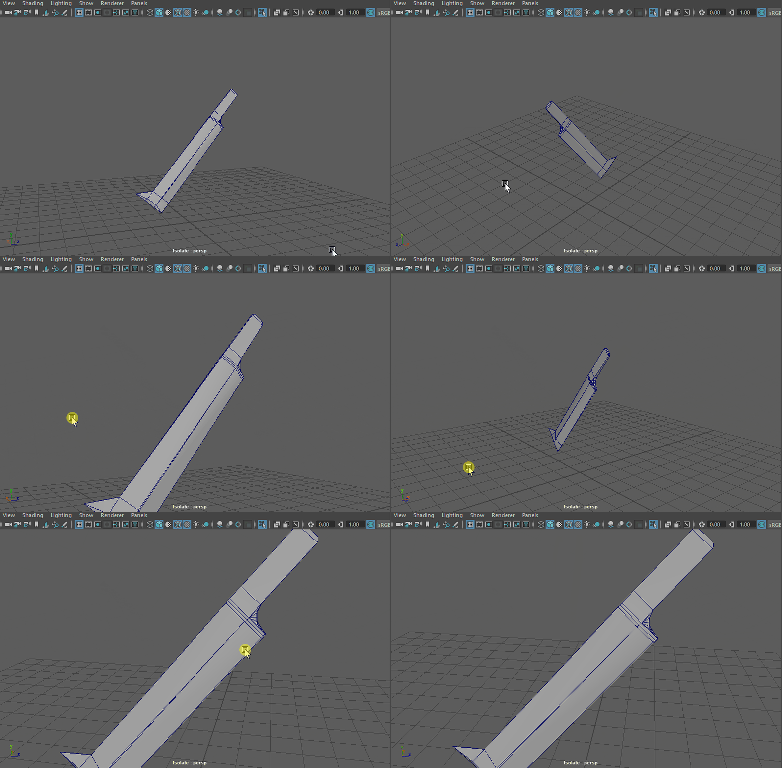
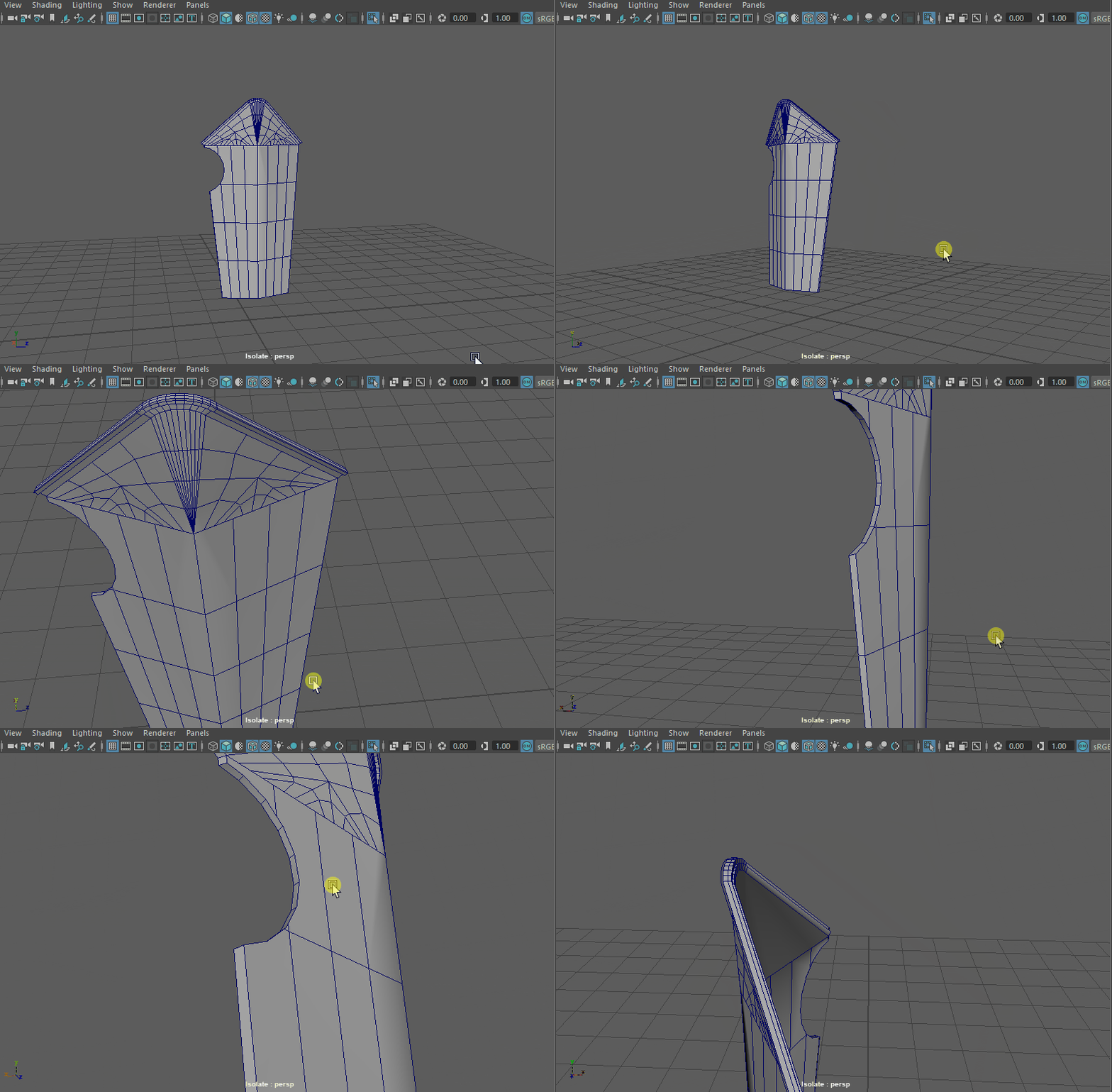
In Maya i modelled three different objects related to lord of the rings a urkai hai sword, a urkai hai shield and an arrow. The hardest one to model was the urkai hai sword as the the topology was weird to deal with especially the tapered base of the sword which created some ngons so i had to use the target wield and merge tools to create nice topology with no ngons. The shield wasn't hard to model it was just a matter of constantly checking my reference to make sure that it match.
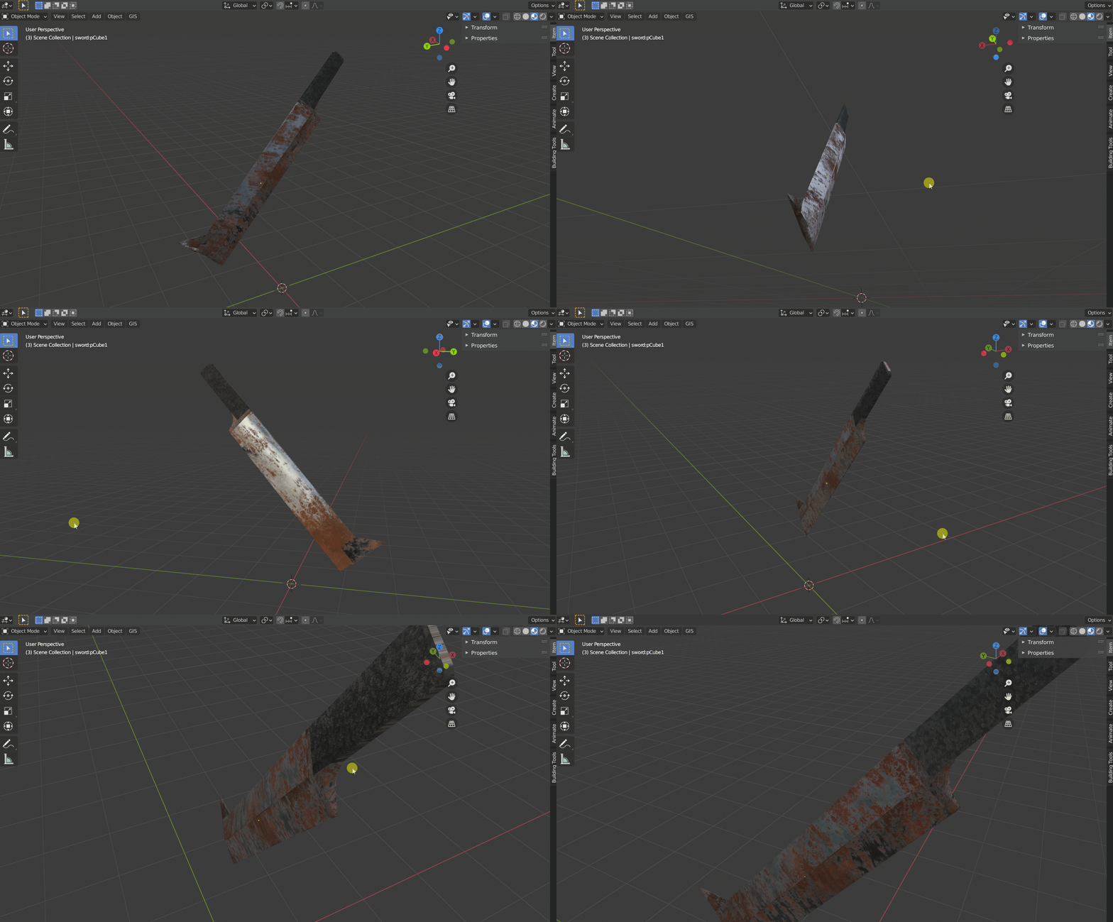
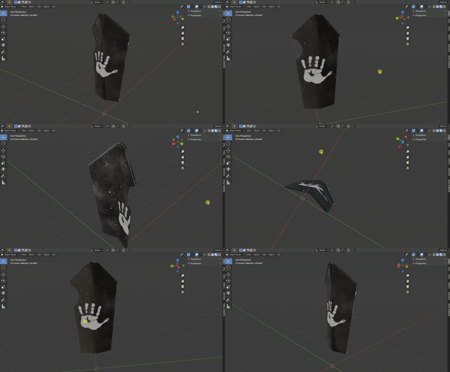
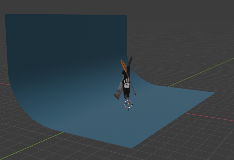
For the UV and texturing stage i exported my models as an FBX and imported it into Blender where i am much more comfortable and faster when it comes to UV's and textures and i don't have much experience in Maya in those subjects so to get it done in time i Smart UV unwrapped each item. Then i used premade textures and applied it to the appropriate areas like leather to the sword handle and spotty/rusty metal to the blade, for the arrow that was a metal texture on the head and a wood on the arrow shaft. The shield was the more complex one to texture as i applied a black scratched up metal texture and then i went to google and got a texture of the white hand of Saruman and took it into photoshop and made it a PNG so that i had an alpha channel as when i took it into blender i would use a mix node to overlay the hand on the black metal, to get it just how i wanted it i used the UV's to properly align it. For the lighting and rendering setup i changed my cameras aspect ratio to 1 on the X and 4 on the Y. For the lightning setup i took a plane and and extruded one edge up and bevelled the edge at the base and bevelled it and added some segments to create a cloth like backdrop and added a blue texture for a nice contrasting backdrop. I used a HDRI for a nice ambient light and then used two point lamps form two different sides to give a nice even lighting to the models. I render the image out and i was very happy with it but i took it into light room and adjusted things like the saturation, exposure, highlights and contrast to that i could really make the image pop with contrast and colour.










Comments