Induction project.
For the induction project we had to make a vertical slice of a top down shooter game and choose between 3 word to pick to theme our game around the words were system, virus and childhood and. once chosen we must in our groups replace the existing artwork from the template file with all original self made art/assets using Maya and Photoshop to actually make the assets and unity to make the actual game. The next point in the brief was to improve upon the game mechanics and rules to make a unique experience for the play and as we go on must show everything we do from what reference we collect and use to the mind maps we make or the artwork we make. After all this is done we must analyse everything from the tools we use to how the game runs and write reflectively on the experiences during the project.

as previously mentioned we had a choice between childhood, virus or system and we chose virus. This is the mind map for our induction project that is themed around virus and using a mind map to brainstorm ideas like the location of where the game will be taking place and the types of enemies that the player will have to fight from their design to how they interactive in the game. An idea that came from the minding mapping was making the game wave based with a time limit for a player to survive.
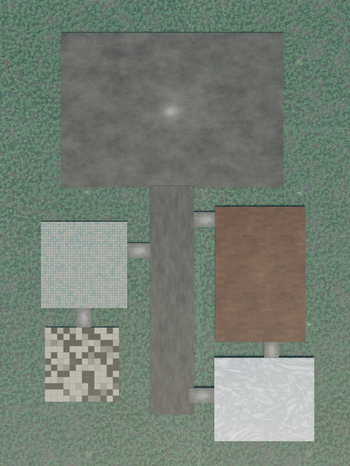
Rough layout mock up
.png)

The idea behind making these layouts is so me and my team members can all have an understanding of how we want to layout the map and where we would want to place thing and how player would move around a map for example the warehouse is the main area in our game so getting an understanding how the shelf are laid out and how it connects and flows into the rest of the map.
Creating textures.
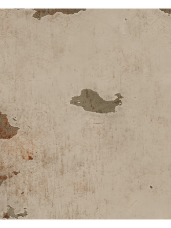
Concrete texture.
Using blender to create the textures for our induction project is very beneficial as i can have the lighting of the games location baked into the texture as i used a HDRI from hdrihaven that was taken in a similar environment (a warehouse) the reason why this is important is because materials in warehouses from concrete on the floor and walls to the wood boxs and pallets all behave differently when reflecting lights and not using an accurate one as possible will lead to different ways my 3D material will come out in the render. The way i went about creating the material was by bringing a plane into my scene and going into the node editor i used a noise texture to create a concrete like pattern on the plane and then putting a color ramp between that and the Mixshader node plugged into the FAC slot to i control the intensity of the noise pattern and using a Principle BSDF node with a roughness maps i got off the internet to give the material imperfections. Using a normal map i got off the internet i plugged that into a displacement node and then put that into the displacement socket, although i displaced the plane i wanted the normal map to do more so i used a subdivision surface modifier to add more polygons to the plane so it can deform more.
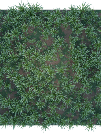
Grass texture.
I first started with getting an a image of single blades of grass to use as modelling reference and texture. Inside of Blender i enabled the "Import images as planes" add on and brought the grass image in as a plane. The modelling was simple as all i had to do was spawn a plane and scale it to match the base shape of the chosen blade of grass. From there i went in to edit mode and selected the top two vertexes and extruded upwards and scaled the vertexes to match the outline of the grass in the reference image. After i modeled the grass i used proportional to give then models a more natural and grass like shape and then i added the Grass image as a material then pressed U to unwrap, in the UV editor i used the unwrapped faces to align them on the corresponding grass blade. Repeating this process three more times until i had enough grass blades to make a bundle of grass after i made one bundle i duplicated it and then added and subtracted blades of grass and changed scales and rotations as well so that they wouldn't have an similarities. When i finish i created a big, medium and small bundles of grass.
Making the dirt texture for the grass bundles to sit on was simple as it was quite similar to making the concrete texture. But i didn't use a noise texture as that wasn't giving the pattern i was looking for in a dirt texture so instead i used a musgrave texture as it looked what i was looking for. After getting the core pattern i then fed two Principle BSDF in to a mix shader which was using the musgrave texture to separate each BSDF nodes which gave me the patchy dirt texture. To add further detail to the material i used a dirt roughness and normal map to add definition to the dirt texture. After both was completed i then made a new collection of all three differing grass bundles then i added a new particle system to the dirt plane so that then i can use the collection as a hair system on it and increased random rotation and scale so that the grass wouldn't look uniform and look natural i also then adjusted the number of points to make a less dense version for blending it to the map, I then Used a outdoor HDRI to light it then rendered it out in 4K.
Tiles texture.
To start with making a procedural tile texture in Blender i used brick texture node and changed the brick tile and height to one so that the material would get its tile look, with that done the next thing i done was added the colour to the i did this with a colour ramp that i put between the brick texture and principle BSDF node and added a light blue, white and blend between both as i think these colours would be most associated with a locker room. Next when add the finer detail to the grooves between the tiles so first i adjusted the mortar size on the brick texture node to a point where i didn't think that they were too thin or thick then i added in a bump node so that in the grooves i just made it would add some definition to them and the texture would have some depth and not look like a flat image with square textures on it. Once the texture was complete i lit it with a indoor HDRI and rendered it out in 4k.
WOOD texture.
To start making the wood texture i found a wooden plank image on google and save it and then took it into Blender and added it to a plane as a material however the initial image was too flat and had to detail and because it was a image off the internet with no normal or roughness maps i had to use a feed the base image into a mix RGB node then into a bump map so that when i added lighting the image actually reacts and looks dynamic, another thing that i did to add variation was put a noise texture into the roughness to add differentiation across the material to make it look like it has actually been walked over and used in general.
Creating assets.
Crate asset.
In Maya I added a cube with 16 subdivision on all axis's and then spawned it I then scaled it out on the Z and X axis's to a point when it resembled a crate shape once that was done I went into face mode and select 3 rows of 4 faces with a face gap between each row. Then I extruded the faces down after that I went around the edges and used the extrude tool to inset the face and then extruded it up to add detail to the crate. as this is being used a top down view I didn't have to model the rest. After that I had to UV unwrap the asset so that I could apply a texture to it. So I cut around the top and created a new UV shell once it was separate I deleted the bottom of the entire mesh as from a top down perspective it won't be seen so texturing that is pointless and saves data/space. I textured the crate with a wood texture however from a top view it was real clear that it was a crate so i made it a collision object then got a fragile sticker and applied a cloth simulation I positioned it over the beginning of a dip on the top of the crate so when it was a cloth simulation it would curve and show that the crate has depth I also used the same method for blood textured to help build the atmosphere.
Bullet asset.
Started by spawning in a cylinder with that had 3 subdivisions then scaling up and inwards to a shape that resembled a bullet then adding a edge loop at the base and scaling that inwards to match my bullet reference. Texturing it was very simple all I did was assign a main gold colour with its metallic settings up and the roughness down to create the reflections that a shiny bullet has and with a surface imperfection image to make the bullet more dirty, i repeat this for the bronze and blue colour and then lit it with a HDRI and rendered it out in 4k
shelf and locker assets
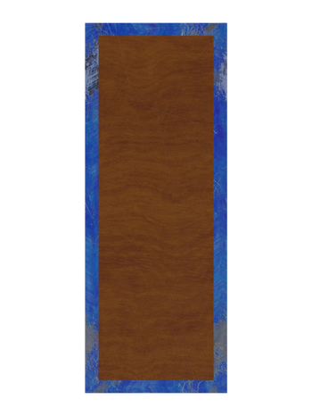
To start modelling the shelf for the main warehouse I added a plane and scaled along the Y and X axis to give me a shelf shape that I was trying to achieve from a reference image and when I had the core shape I then inset the face and then assigned a different material to the inner face which was a wood texture and then the boarder has a rough blue material to give it an industrial warehouse look to it. I lit it with a HDRI and rendered out 4 different versions were I moved the UV's around so that when I use the same shelf multiple time it doesn't have the same patterns and has variety.
With the lockers I once again started by looking at reference and a issue that I came across with making the lockers from a top down perspective so going into this I decided to get creative in ways to show that it is a locker so I was going to make a normal version with its door closed and make a version with a open door to that I could give the play a visual cue that they were a locker. The closed version was nothing more than a plane with a metallic texture applied and the open version was a cube with an edge extruded outward and extruded again to give the door some thickness then on that I a blue paint metal texture for the door and rendering out different versions with differing UV's like before.
Sofa asset
Starting by getting reference so that I can then block out a rough shape of the sofa by importing the reference into blender as a plane then went into top view and spawned a cube which I then scaled down to match the edge of the the sofa once I had the edge of the sofa I bevelled the back two corners. To make the cushions I spawned a cube and gave it a rough cushion shape then went into sculpt mode and sculpted it to look like a pillow then after that duplicated the pillow and made alterations so that when I used 4 versions to make the actual sofa cushions without any repetitions once that was done I applied a fabric texture to each of the sofa pieces.
Fridge asset
To make the fridge asset for the the lounge area I spawned a cube and then scaled it to a rough fridge shape. On the front I inset the face a bit then extruded out a bit to create to create the gap between the door and body for the door I extruded that out again the extruded the top to match the body. Then I beveled the right and left of the top of the body and fridge to give it a less sharp and more fridge like shape. For the texturing I put a rubber material in the gap between the body and door then made a white metallic material for the body. I put the same HDRI that I used for the lounge in the scene so it matched the lighting then rendered it out in 4K.
Making the map.
With all the textures made and rendered out i made larger versions of them so that when scaled up it wouldn't pixelate and look weird. I started with the grass and created 2 larger version with differing seeds on the particle system so that when put together similar patterns in the grass couldn't be seen. After that i then layered a larger version of the concrete texture over the grass to create the main area of the warehouse then using a smaller version of the concrete to make the corridor that the play will use to access other parts of the map. After adding the workers longue/kitchen I thought that there was more space to add another room so I then created the reception area to give more manoeuvrability for the player. once i built the map out in blender I rendered 2 versions of the map out with two different HDRI's this was an important choices as lighting is important and will dictate the atmosphere of your game and how the player experiences it so I decided to get with the second render as the back ground for the game.
To start I created a new 2D Unity project and titled it the name of our game "Left to survive". When the file was created I dragged and dropped the map render I made in blender into the project window and then the hierarchy so that it would then appear in unity. After the map was in Unity I brought in a brick texture that I made procedurally in blender using the brick node like in the tile texture that I previously made. I added a Polygon Collider 2D component so that this would act as a barrier as the brick texture will be the outline of the map and will be what keeps the player in bounds. Once the entire map was outlined I then imported the character/hero asset that my team member made with the asset in unity I put a Polygon collider 2D and Rigid body 2D with the collisions and physics objects set up I test played and one issue that I found was that the character moved and rotated too fast and slid across the map so rigid body 2D setting and played around with the friction, mass and angular friction until I found settings that I liked and felt natural to play as. Another issue that I found was that the path ways that connect the rooms are just too small for the player to get through so I will fix that by going into blender and enlarging the path ways so that the player can comfortably move through, I also made the boarder one object in blender because each 4k tile was more space then need so by making it one object it was properly optimized.
Using the bullet asset that I previously made I brought it into unity as a PNG and applied a Polygon collider 2D, Rigid body 2D and a Bullet components so that it will actually keep track of who it shoots. I then dragged and dropped the bullet from the hierarchy to the prefab folder in the prefab window to make the bullet a prefab so that it can be instanced when shot. I then spawned a empty and then lined up to my empty to the barrel of the gun and on the empty applied the object shooter component then dragged and dropped the prefab of the bullet into the prefab to spawn section of the shooter component, I then changed the X shoot direction to 0 and kept the Y at 1 to have the shooter emitter shoot relatively from the barrel.
Setting up the game in unity.
Using the previously made Locker, warehouse shelf and shower divider assets that I had made previously I then brought them into unity and put a a Polygon collider 2D on each of them then I went to laying them out. With the warehouse shelfs I laid some around the edges and then random laid different versions of each render out randomly within the warehouse to create a challenge for the player as the shelfs are randomised. Issues I faced when setting up the shelfs was that they are either too close or big so I had to play around in game mode to find the optimal sizes and layout for the player to be able to navigate through. With the lockers I again laid them around the sides and in the centre, for this section of the map the way I created open version not just to distinguish the fact its a locker it means the play has to be careful when they weave through the locker room. The shower room and the dividers were just laid out normally. I also used the bloody crate assets as collision objects as another thing the play has to look out for and as I previously said it also helps with the atmosphere.
setting up enemies in unity.
Starting by importing the zombie asset then putting a rigid body and polygon collision object on it so it actually works also unticking is trigger so that the zombie doesn't go through objects. I then set up the following script and made the player the target. Then I used the modify health script so that when the zombie hits the player it actually subtracts the players health next was the destroying for points script so that the play would stand a chance and be able to kill the zombies and collect points so that they can win. To set up the the zombie spawning I dropped the zombie asset in the project window to prefab it then dropped the prefab into the object creation component so that it would then keep putting zombies within the map, I then placed multiple spawners around the map so that it would force the player to move around.
Reflecting and evaluation on the project.
With project now complete now is the stage for a review of the project and what elements I believe are good and elements that I think could have been improved. To start with the positive I was happy with how the map came out given the timeframe that we were given for this project, textures and assets were created in Blender and Maya using a variety of techniques like procedural node sets ups and cloth simulations to give volume of depth to assets. From items like the crates or the lounge area I think that they came out looking well made and high quality with self made assets that get the job done of establishing where the game is actually set. The character model my team mate Alex made fits well into the map as well as the zombies. However, elements that i would like to improve about the game for starters the movement system got glitch and rotation and movement were both on WASD on the day the project was due and there just wasn't enough time to fix it so we just had to accept that and another thing would be the menus I had made custom art for left to survive (the banner for this page) and I didn't have it on my person on friday so we couldn't implement it into the game menu and had to stick with a image we got off google and i would have made the button in the main menu a bit bigger so more people would be able to see it quicker. All in all i am both happy and proud with how this project came out and i believe if we had just a few more days it we could have gotten the issues ironed out but i think for a first time experience using unity it was a success i also learned a lot in blender for making textures. I think my favourite part of the project was just how much that i learned from unity, blender and actually building and publishing my game on itich.io.


